Posts

Showing posts from February, 2020

Development and Test Pieces

Image
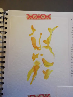
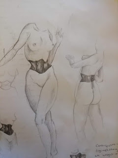
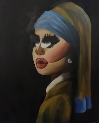
Subject 1  I love to experiment with line and watercolour so I created these for my human form unit this year.   Subject 1:  Minimal line work and use of watercolour to put in only essential lines. Subject 2:  Continual line doodles to practice drawing a woman's form Subject 3:  Abstract style nudes with loose lifework and watercolour washes. Subject 2 Subject 3

Eyes - Watercolour

Image
This watercolour was made for our unit at college named, ;On The Periphery'.  I wanted to make something that meant a lot to me so I chose the topic of mental health.  The piece represents anxiety and the feeling of having all eyes on you.  I was inspired by an experience I had during the first year of college where we had to do a very informal sketchbook presentation to the class where we just sat in our normal seats but I froze up and needed to leave as I had an enormous panic attack.  This painting means a lot to me as it shows how much I've grown because I can now give presentations to the class with very little stress.  This is one of the pieces I'd like to bring to an interview because it's one to be appreciated up close.  I find it looks rather underwhelming in photographs.

Glenn Howerton - Oils

Image
This is an experimental piece just to see whether oil paint and watercolour paper were compatible as I didn't have the funds for canvases.  I gathered that they did work together, however I had difficulty in blending the paints.  I really love the shadows in this piece but I think that the hair and the eyes sort of cancel out what went well.

Keith Richards - Oils

Image
This piece was  a work in progress until a couple days ago when I absolutely and utterly ruined it.  This is the painting at its peak.  I spent around 6 hours on this which is a pretty fast painting for me.  It was a gift for my dad who I hadn't seen in two years due to family conflicts and I thought a painting of one of his idols would be an excellent peacemaking offer; however I haven't yet broken the news to him that I ravaged it.  I used only three colours: black, payne's grey and titanium white to create a monochromatic look.  This WAS one of my favourite portraits I have done and would have been fabulous to bring for an interview, so I apologise.

Sketches

Image
  I was greatly inspired by the artist Andrew Loomis as well as my love for all things pin-up and a lot of my doodles reflect how I present myself as a person; such as the corsets and vintage hairstyles. These sketches were for my human form unit at college and although they're rough, I do love them a lot.  I adore drawing women with exaggerated features such as tiny waists and large busts and hips but I tried to keep these looking as  realistic as possible.

Ink Piece

Image
This is a ink, sketchy style illustration that encapsulates the dehumanisation of women in pornography.  Women are expected to wilfully submit to men and be treated as slaves in the porn industry so I wanted to draw a female form, cuffed and bound, with a bouquet of flowers and foliage in place of a head in order to represent the lack of self.  I also wanted to juxtapose the rough and dark nature of BDSM with something as delicate as flowers.  I completed this piece in the first year of college for the topic, 'Dark Intention' and I used an ink pen in a rough, loose manner.

Girl With a Pearl Earring - A Parody

Image
Although this isn't my best oil painting, it was however, my first.  I have decided to include this in my portfolio because it shows my progress of my journey in oil painting.  This was made as a satirical take on Vermeer's infamous painting, 'Girl With a Pearl Earring'.  I wanted to corrupt this piece with harsh drag queen makeup and enormous lashes as the original is considered one of the most beautiful paintings in the world. However this wasn't created just to do that.  I made this to incorporate two different art forms, painting and drag.  The two juxtapose each other well and creates a memorable impact on viewers, whether they understand the meaning or not.  I'm extremely proud of this piece and it sparked a greater interest in oils, which is now my primary medium .

Nude in Oils

Image
This painting was a rollercoaster and a half.  This is the largest piece of artwork I have ever created and I faced a lot of difficulties along the way.  I started this piece on a whim with no idea what I was doing and without the use of reference pictures.  I had never painted a nude female form in oil paints as of then but I'm fairly happy with how it turned out and am very proud of myself for painting this all from my head.  I did a sort of underpainting, but not done in the typical manner.  I used only fat layers up until I added glazes and she underwent many a nose job, face lift and numerous tucks but I got it as close to my vision as my ability would allow me.  When I started this painting I had a faint vision that I wanted it to resemble the work of Larry Vincent Garrison.  I wanted the viewer to feel voyeuristic and as though they walked in on something they shouldn't have and the subject of the painting is angry and upset at this.  I l...

Ceramic Vase

Image
I created this ceramic vase inspired by the potter Kate Malone.  I'm rather inexperienced with claywork but I'm pleased with it.  I used to coil method to build up the height and used a combination of different glazes and fired them in a kiln to achieve the appearance of a blackberry.

Charlie Day - Watercolour

Image
The beauty of portraiture is that you can capture the nature and essence of a person or character and have it be everlasting, this is why I am so drawn to it and why there is a lot of it in my portfolio.  This portrait is the first piece I created when I first purchased the Winsor Newton  Cotman palette.  It is of the actor Charlie Day as I was inspired by his character in the programme 'It's Always Sunny in Philadelphia' as his character is so naive yet outrageous and I adore painting his structure.

Monoprinting

Image
 Here is a monoprint of a Death Head Hawk Moth  from the first topic from when I started college;  'Dark Intention'.  I wanted to create something     that would look good as a print if I were to sell   my art.  My target audience was people     interested in dark and gothic themed art.  The Death Head Moth is directly associated with the concept of death and therefore links to the name of the unit.

Work in Progress - Self Portrait

Image
Underpainting I started this self-portrait as a part of a class project at college - and during this I learned how to properly, classically oil paint; even though I had been oil painting for a long while before.  I chose the more comical route for my painting because I felt as though posing and trying to make myself look elegant didn't truly capture my personality and how I put a satirical spin on things.  I wanted to create something that juxtaposes my 50s glamour with something a little bit grotesque.  I wanted it to be eye-catching, whether you like my piece or not you cannot deny that it is memorable. Most up to date photograph of my self portrait.